
St. Raphael Wellness Centre (SRWC)
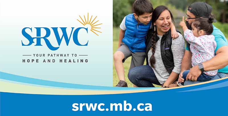
Design objective: To refresh SRWC’s brand that was suffering from an outdated image and had outgrown its effectiveness.
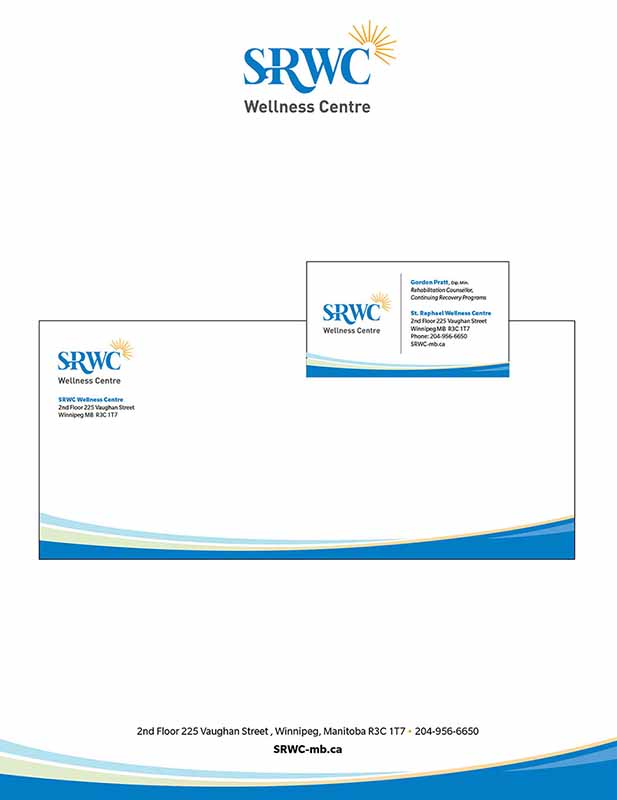
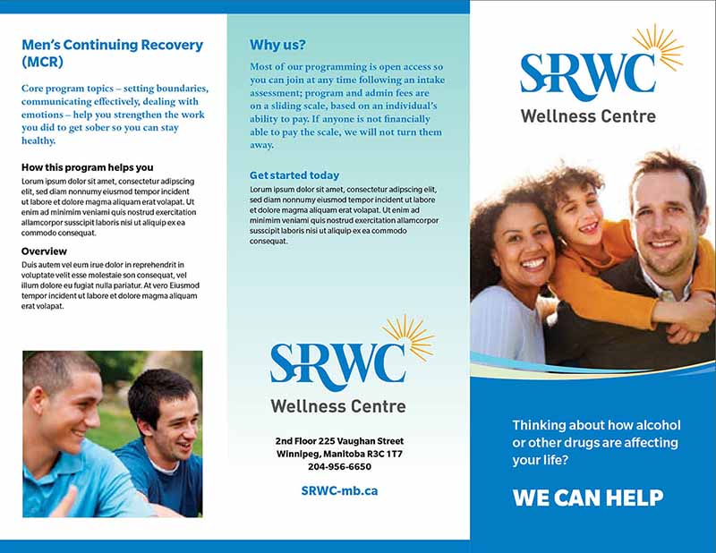
Results: Strong acronym proportion that aims for easy and recognizable brand, and provide a right direction and voice to the message of the organization. Typography builds brand recognition. Sun visual represents SRWC’s warm approach treatment process as well as client’s expectations: hope, change – friendly, care.
Delivered material:
• Logo
• Visual Identity
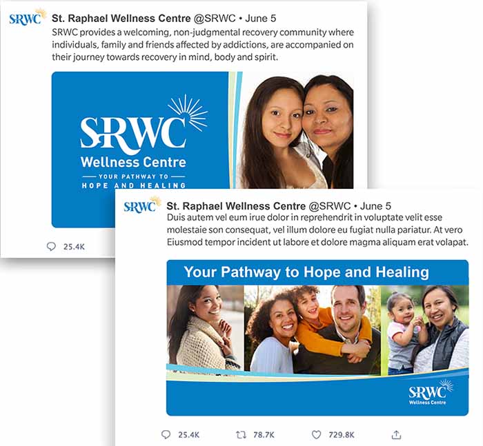
• Social media ads
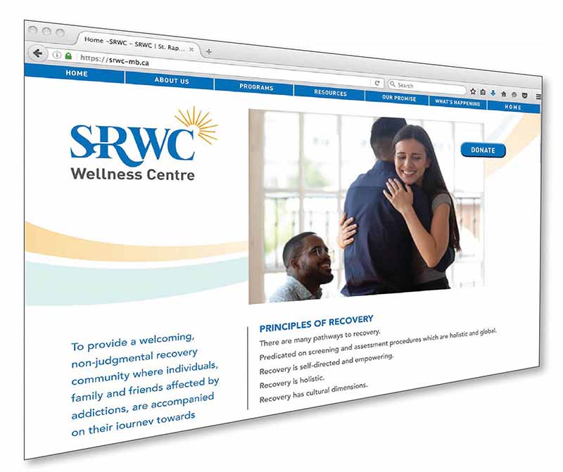
• Website design
• Stationery
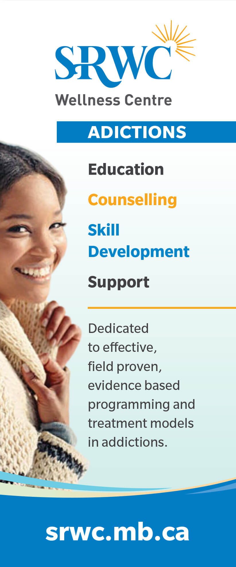
• Retractable banners
• Signage
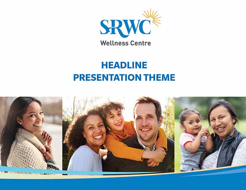
• PowerPoint templates, etc.
Branding and Visual Identity

© 2026. St. Raphael Wellness Centre creative material shown herein is safeguarded by its respective copyright.